
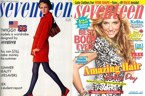
Don't get me wrong...I am very into slanted type, text treatments, outlines and crazy colors. But I am also into classy, simplistic design. Love the contrast of these two magazine covers next to each other. Funny how both seem timeless... though the one on the right is more recent, it could prob pass for 70s/retro-time-era. Twiggy's cover really lets the photo speak for itself whereas whats-her-face on the most recent issue seems to be covered-up. I don't blame the designer though, Twiggy is much more beautiful.
-J.
No comments:
Post a Comment